Monday 17 July 2006

Skins

Our next project was to make "skins". The idea was to put some golden fluids clear tar gel into a small cup and add golden fluids acrylic paint. The clear tar gel is self levelling. However, I made a bit of a boo boo with my order and ended up with coarse garnet gel. So, I thought to myself, might as well play with this and a few other bases as well.

I put them on a window to photograph in order to show off translucency.
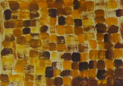
1 & 2. Garnet gel and golden fluid acrylics
3. Cryla texture paste
4. Gloss Enamel
5. Tubed acrylic paint
6. Acrylic Paint & PVA


Some Close Ups

Enamel Acrylic Gloss


PVA and Acrylic


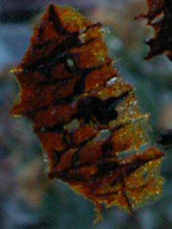
Golden Garnet Gel and Golden Fluids Acrylics


Sunday 16 July 2006

Oxford

Yesterday (July 15th 2006) Paul and I took my brother Richard home to Oxford. It was a glorious summers day and we decided to have lunch at the Victoria Arms. I had last been there about 30 years ago and had only approached it from the river on a couple of punting trips. I had no idea how to find it by car, and we weren't up for punting ot it that day. Luckily, my memory and the Internet served me well and I was able to find directions.

I had a King Prawn salad for lunch, so delicious.

I took my new camera with me of course and here is a small record.

Oxford

The Victoria Arms.


Not one of the best pub signs I have seen.


Rather a lot of punts.


An interesting tree.


An interesting gate in the village of Old Marston


I decided to try taking photos from the car. This is a bridge leading to Cuttleslowe Park.

Sunday 9 July 2006

Layers

The idea of this challenge is to use stamping, resisting and translucent paints.

Complementary Colours - 4

With this one, I used Nivea cream as a resist over some of the washes. This was after reading that vaseline (petroleum jelly) is a good resist. I couldn't find any (I'm sure I have a huge pot), so Nivea, which can be used as a barrier cream seemed to be the thing to use.

Complementary Colours - 3


Believe it or not, this is still yellow and purple. I'm amazed at the amount of brown that came through. In "real life" some of the brown is very dark and chocolate looking.

Complementary Colours - 2

Monochromatic Painting - Image 3


This is my favourite of the three, I really like the dynamism of the strokes.

Complementary Colours - 1


This challenge is to use complementary colours, i.e colours which are opposite to each other on the colour wheel. I used yellow and purple.

Monochromatic Painting - Image 2


This is the second one, trying to be more free with the strokes.

Monochromatic Painting - Image 1


This challenge was to use just one colour and white. This is the first one I did, experimenting with brush strokes with a fairly wide brush that I have.